Get Upto 60% Discount
Grab 50% Discount
for all custom logos
Please fill the form below & proceed
Lamborghini modifies its logo after a long time

May 2 , 2024 Posted by admin
Have you heard about Lamborghini’s—a manufacturer of high-end automobiles—new logo? Twenty years later, they updated their logo. Their motive behind this logo change is to push people to new limits. The previous automobile company logo was more intricate and 3D but is now simple and appealing, way better than before.
We will discuss all of Lamborghini’s logo design changes and the reason behind them. Let’s investigate.
Contact Logo Magicians to develop or redesign a logo for your automobile business. Have a free video session with us.
Why did Lamborghini change its logo?

Lamborghini is changing the way its vehicles are built. It is attempting to lower carbon emissions by concentrating on producing cars in a more environmentally responsible manner. This is part of its new approach to making a name for itself in the automobile industry.
The new logo has a purpose beyond appearances. It’s a component of Lamborghini’s general redesign. They want to come across as fearless, unexpected, and authentic. These principles and their dedication to change are visible in the new logo.
The Revuelto is the most recent version of the Lamborghini brandmark. It blends elements of the classic and contemporary styles. The newest logo is a representation of strength, confidence, and power.
What modifications does Lamborghini apply to its logo?
Recently, Lamborghini made some adjustments to its logo; however, they aren’t immediately noticeable. Upon initial observation, the automobile company logo appears largely the same. You only notice the minute variations when you examine them more closely.
There’s a somewhat subdued crest in the new Lamborghini logo. It looked three-dimensional before.
Typeface

Only a few changes occur in the typeface used in the new logo. The “Lamborghini” text now widens slightly. Though it still sits at the top of the automobile company logo, its appearance has expanded. According to Lamborghini, this new typeface echoes the angular shapes found in their high-end vehicles.
According to Lamborghini, the colors are bold and simple, and the new automobile company logo has a broader Lamborghini typeface than the previous one. As part of a fresh approach, they revamped the logo to more accurately convey their objective’s daring, unexpected, and sincere qualities.
Color

The Lamborghini logo used to be primarily yellow and gold. But these days, the primary colors are black and white, with gold and yellow serving as secondary hues. This change gives it an appearance reminiscent of the early 1970s logo.
The Shield is not for social media channels
On digital channels such as social media and the website, Lamborghini’s new logo lacks its famous shield. This provides the automobile industry logo with a sleeker, more contemporary look that complements the brand. Still, the shield will cover the cars themselves.
In Lamborghini’s logo, there once was a charging bull enclosed in a shield. But the shield and the bull are no longer together. This is a huge shift. The bull will only be visible on the company’s digital channels without the shield. This increases the bull’s visibility and significance in various contexts.
Lamborghini logo Evolution

The Lamborghini logo has a very interesting logo history, which has gradually improved over the decades due to business growth. Here is the Lamborghini logo’s history:
Triangular logo

1950 saw the start of Lamborghini’s auto production. Their initial focus was on producing tractors. Their logo was back then a basic triangle with three smaller triangles inside. The letters F, L, and C on each triangle in the logo are the first words of the founder, Ferruccio Lamborghini Cento. From 1953 until 1963, this automobile company logo was in use.
Shield logo

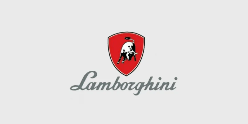
Lamborghini updated its logo in 1963 after deciding to concentrate on producing sports cars. The new logo enclosed a fierce bull in a shield-shaped design. Below the red shield, the brand name exists. The enduring shield insignia of Lamborghini that we still recognize today got its start with this business logo design.
Golden-yellow color palette logo
In 1972 and 1974, Lamborghini changed its logo once more, and it remained that way until 1998. They unveiled the logo that is more recognizable to us now, which has a golden yellow color scheme. Then, in 1974, they went to a black-and-white color scheme. Adding the brand name “Lamborghini” above the charging bull was one distinctive feature of this automobile company logo.
From 1998 to the present, the Lamborghini logo has had a sleek, modern aesthetic. The crest is intricate, displaying the bull’s muscles in particular. The background is gold and black, and the shield is glossy. It is a golden bull. Before recent changeovers, this automobile company logo constituted a significant portion of the company’s image.
You might not notice several huge details in the new Lamborghini logo at first. Redesigning a logo may teach you a lot and is a key aspect of branding tactics.
Logo Magicians is a fantastic opportunity to create an automobile industry logo for your company. Using their expertise, you can build a timeless automobile company logo. Our company logo design service is quite helpful for any of your logo needs!
Design an enduring automobile company logo from us
Conclusion
Premium automaker Lamborghini has altered its logo for the first time in twenty years. Because of the subtle changes, they are difficult to notice immediately. This automobile company logo’s gold and yellow color scheme exists now; instead, a more vintage black and white color scheme aligns with their new branding strategies. The typeface used to represent the brand name “Lamborghini” has been somewhat changed.
Contact Logo Magicians for the most affordable logo design services in the USA.


Leave a Reply