Get Upto 60% Discount
Grab 50% Discount
for all custom logos
Please fill the form below & proceed
Rolls-Royce: Another Company Overhauls Its Graphic Design Logo

August 31 , 2020 Posted by admin
Today, every brand is changing its logos to move forward with digital-friendly marketing. Rolls Royce, the UK’s most luxurious motor car brand, executed such a marketing tactic. Rolls Royce changed its logo in 2020 to modernize its company, which could appeal to a new generation.
So. Here in this blog, we will discuss the features of the new logo design of Rolls Royce, a reason to change the company logo design, and some considerations that every company should consider when updating their digital or business logo design.
Features of Rolls Royce New Graphic Design Logo
Spirit of Ecstasy

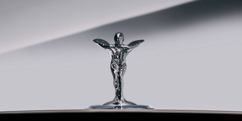
The new graphic design logo centers mainly on the “Spirit of Ecstasy,” i.e., the emblem logo design ideas; the well-known sculptor Charles Robinson Sykes designed it in the year 1911. It is the figurine of a woman with arms spread wide behind her and leaning forward. The emblem has seen 11 iterations. Currently, the Spirit of Ecstasy emblem is smaller than the previous versions and is spring-loaded so that if the car is ever hit, the emblem will retract. Every Rolls-Royce car has this emblem on the bonnet.
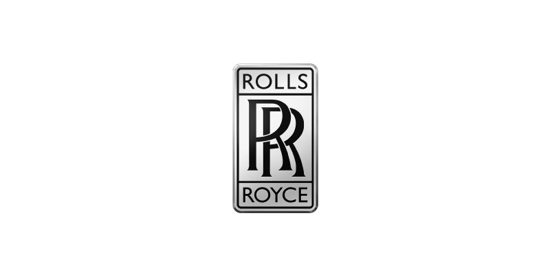
This Rolls Royce graphic logo design emphasizes the “Spirit of Ecstasy” symbol but keeps the primary logo’s famous double-R monogram as a sign of its history. The company employs Pentagram Design Company to update the design. Its new logo aim to lead the company’s brand identity while changing the chrome-effect dual-R called “badge of honor,” used in old designs as an icon on digital media platforms such as Instagram.
The Spirit of Ecstasy insignia has been recreated more abstractly as an image like a silken fabric. A professional logo designer enters multiple codes into a processor to make a pattern created by various parallel lines overlapping and curved to display the female figure shape.
Figurine Head

You will see that the new business logo came with the emblem turning from facing left to facing right so they could give the impression of something moving forward. Another change is the decrease in the reflective marks.
Also, you will notice that the figurine has a base underneath to let everyone know that the figure was that of a statue and not of an actual person. The designers who worked on the emblem paid attention to every detail, like the figurine’s head, waist, the span of the wings, and face. They did their best not to sexualize the figurine.
Wordmark

The team also redesigned the company’s wordmark to build a highly sophisticated logo that focuses on the new design’s future plan. This involves changing the font from Gill Sans to Riviera Nights. Every letter is capitalized, and the R’s also become big to provide a direct association with the monogram.
Moreover, the new logo of Rolls Royce Motor Cars for rebranding also keeps the company distinct from Rolls Royce Engineering Company, which is mainly recognized for manufacturing aircraft engines and applies a Dual-R monogram in its logo.
Key Reason for Rolls Royce Motor Car Logo Update
Differentiate From Rolls-Royce Engineering Company
As we discussed, another reason for the rebranding via a new logo design is that the company needed to differentiate between Rolls-Royce Motor Cars and Rolls-Royce Engineering. Rolls-Royce Motor Cars are associated with its luxury cars, and Rolls-Royce Engineering is concerned with aircraft engines. Both brands use the double R monogram in their graphic design logo. That is why the company thought of changing the Motor Cars logo.
To Modernize For Digital Channels

The company agreed that although the emblem was the brand’s representative, and needed simplification for digital channels. Another reason was that the logo needed to be more modern for the company’s digital image. Before this one, the company logo design for digital platforms was double R. That is why there is a need to revamp the logo.
Things To Consider When Updating a Logo For Your Digital Marketing

Successful marketing is currently concentrating on developing brands and logos that are “digital friendly,” from small enterprises to big organizations. Some companies face the challenge of finding a solution while maintaining the brand’s existing visual identity. Here you can consider things when updating a Logo to perform strongly on digital media.
COLOR: It can be necessary to use one color for print and a somewhat different one for digital when changing color for a more RGB-friendly environment.
SIMPLIFICATION: Plentiful information or texture is either lost or looks to “dirty” up the appearance onscreen at small sizes or low quality.
FLATTENING: Removing shadows, bevels, embossing, and any other 3D features from logos can give their shape and color more visual impact on digital screens, which is the most popular current trend for “digitalizing” businesses. Go for simplification for high impact.
If you are considering updating your digital or business logo designs, you have reached the right spot. Logo Magician, the best NYC logo design company, offers you the best graphic design logo from our artistic graphic designers. Visit our website to get familiar with us.
FONT CONSIDERATIONS: Typography, mostly on small screens, shouts for changes in spacing, kerning, and shapes of the letters for aesthetics and readability. The central difficulty for an excellent brand is to remain in the spirit of historic typography while enhancing higher achievements in digital platforms. Having a micro type in your logo from a typeface master is a way to show your logo with appealing logo fonts.
OVERALL BALANCE: Much like your concern about typography, updating branding components like wordmarks, logos, photos, slogans, and text is a good approach for a digitally friendly logo design.
Conclusion
The above example of Rolls Royce displays a seamless change that maintains the integrity of the original brand expression while enabling it to perform better in a digital world.
This is the right time to do it if you want to revamp your brand or modernize it for the digital age through digital marketing. Go online and search for “NYC logo design Company” or best “logo design company near me” and then research the brands that come up.

Leave a Reply